Daily Targum App
As part of the Rutgers Blueprint Fellowship, I worked with a team to design a mobile app for the Daily Targum, the official student newspaper of Rutgers University. This project aimed to create a modern, mobile-first experience for students to easily access campus news. We chose the Daily Targum as our client because one of our teammates worked there, which gave us insider access to the team and readers. That helped us ground our design process in real user needs.
Client:
Rutgers Blueprint Fellowship
My Role:
UX Designer
Time:
3 months
Tools
Figma, Google Forms
PROBLEM
The Daily Targum lacked a mobile presence and students were missing out on campus news
The Daily Targum was well-established on the web but lacked a dedicated mobile app. Students often missed important news or relied on scattered social media links to stay updated. Given our direct access to Rutgers students and Targum staff, we saw an opportunity to create a centralized news experience that was both mobile-friendly and tailored to student behaviors.
SOLUTION
A mobile app tailored to student reading habits, built for quick access, category filtering, and breaking news
The solution includes
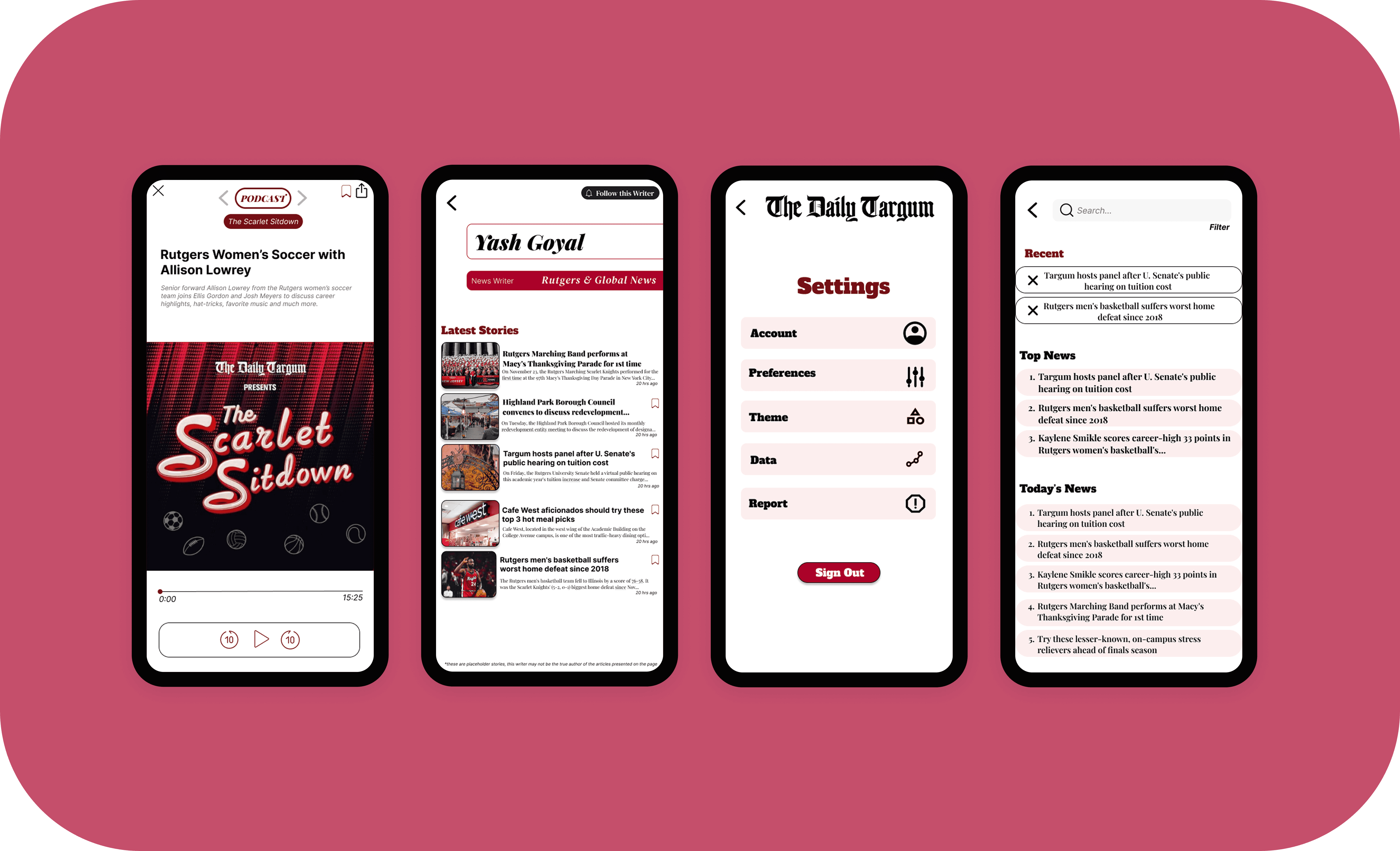
Swipeable category filters for quick access to News, Opinion, Sports, and more
Clean, card-style previews that let users quickly scan headlines and summaries
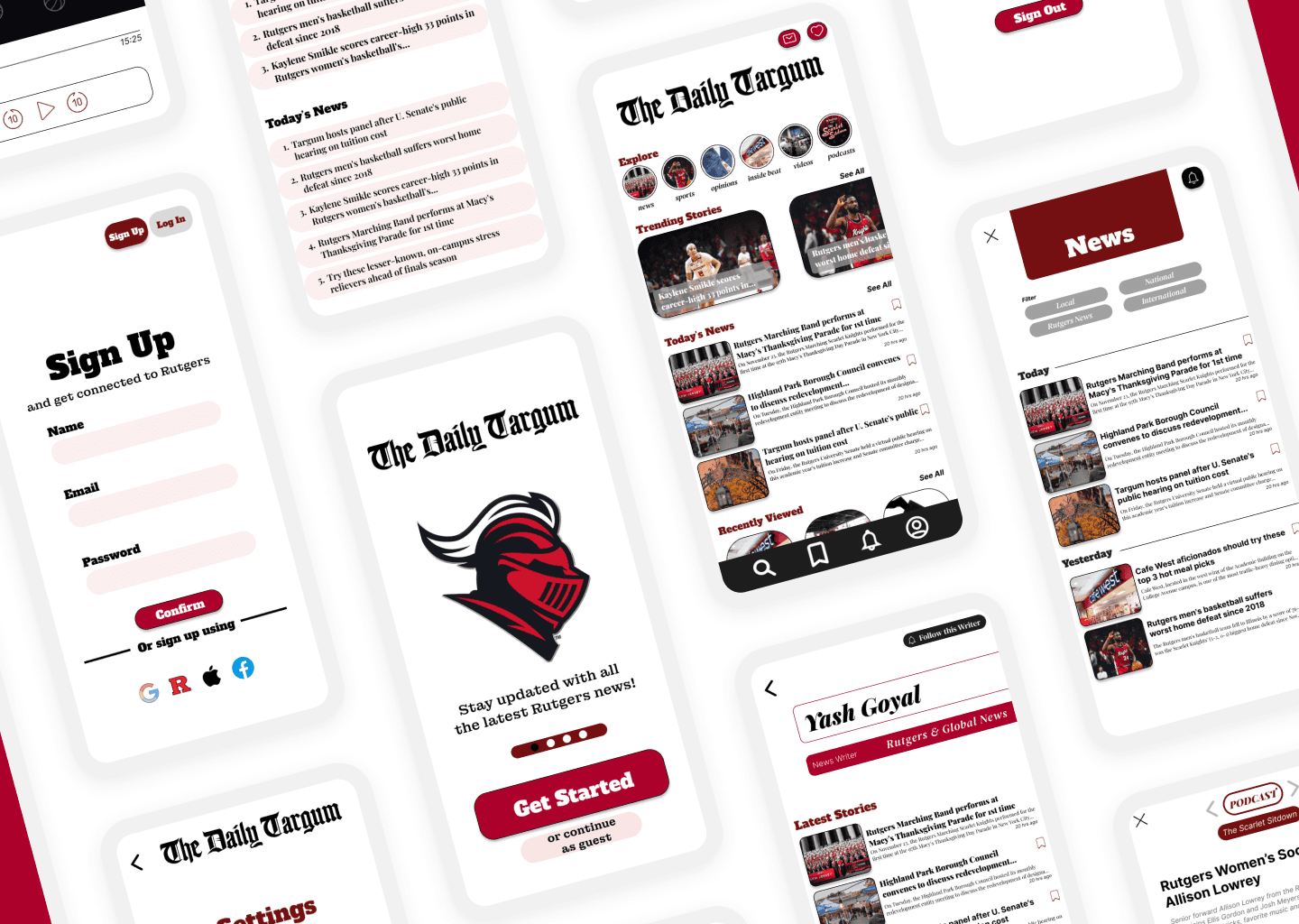
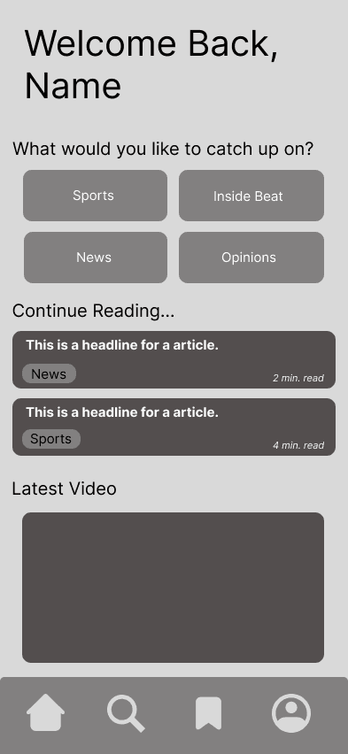
A simple article view focused on readability and distraction-free content
"Save for later" and sharing features to keep content accessible and shareable
Push notification support for breaking campus news and event alerts
Bottom tab navigation that improves discoverability and avoids hidden menus
Each feature was informed by direct feedback from Rutgers students and designed to make reading the news effortless and engaging.

USER RESEARCH
We surveyed Rutgers students to uncover reading habits, pain points, and feature needs
To guide our design, we surveyed and interviewed around 30 Rutgers students from different campuses and majors. We wanted to understand how they currently access campus news, what frustrations they faced, and what they wanted in a news-reading app.
Key insights:
Students often read articles between classes or while commuting
Most accessed articles through social media platforms like Instagram, Twitter/X, or GroupMe, rather than going directly to the Daily Targum website
There was strong interest in filtering content by category and saving articles for later
Many students wanted breaking news notifications, especially for campus events and emergencies
These insights showed us that students were already engaging with news in bite-sized, scrollable formats — just not in one central app.

IDEATION & WIREFRAMING
Early sketches and user flows helped us define a structure that matched how students browse
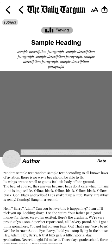
Based on our research, we created user flows for browsing, filtering, saving, and sharing articles. I led the development of low-fidelity wireframes that focused on accessibility, mobile-first usability, and quick content access.
Because students were used to discovering news through social media, we designed the home screen to mimic familiar social app patterns — such as:
A vertically scrollable feed
Eye-catching headline cards
Simple tap-to-read article previews
This made the experience more intuitive and helped reduce friction for first-time users.
VISUAL DESIGN & PROTOTYPING
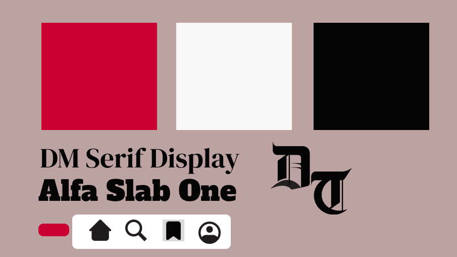
We translated insights into a clean, mobile-first interface aligned with the Targum’s identity
In Figma, I built high-fidelity mockups using the Daily Targum’s color palette and typography to preserve brand identity while modernizing the interface. We used serif fonts for headlines to match the tone of traditional journalism and sans-serif fonts for the body text to improve on-screen readability.
After sharing our prototype with fellowship mentors and the Daily Targum team, we made several key improvements:
Increased contrast for better readability
Adjusted spacing and visual hierarchy in article cards
Replaced the hamburger menu with a more intuitive bottom navigation bar
These changes made the app easier to use and better aligned with mobile UI best practices.
OUTCOME
Delivered a fully functional, research-backed prototype ready for student use
The final deliverable was a complete, interactive prototype in Figma that the Daily Targum team can use as a foundation for future development. It reflects real student behavior, aligns with the brand, and solves clear usability gaps.
REFLECTION
This project showed me the power of designing with direct access to real users
Working on this project taught me how to design with empathy by staying close to the people I was designing for. Having direct access to our users made our research more effective, our iterations faster, and our solution more relevant. It also helped me sharpen my wireframing, UI design, and stakeholder communication skills.
