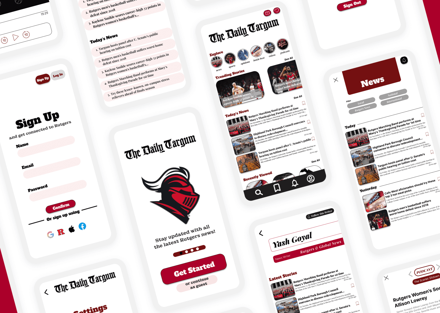
First Choice Physical Therapy Website
As both the designer and front-end developer, I led the creation of a full website for First Choice Physical Therapy, the clinic where I worked as a Patient Care Coordinator. With no prior digital presence, the clinic relied heavily on phone calls and paper forms — which often led to delays, confusion, and extra work for both patients and staff. My unique position at the front desk gave me direct insight into recurring pain points, allowing me to shape a solution grounded in real needs. The result is a modern, patient-friendly website that streamlines scheduling, improves clarity, and reflects the professionalism of the care we provide.
Client:
First Choice Physical Therapy
My Role:
UX/UI Designer · Front-End Developer · Researcher
Timeline:
January 2025 – May 2025
Tools
Figma, Framer, React, JavaScript, HTML/CSS, FormSubmit, Notion
PROBLEM
Patients lacked a digital space to learn about the clinic, services, or how to book an appointment
First Choice PT had no website, making it difficult for new patients to find the clinic, understand its services, or prepare for their first visit. Patients frequently called with questions that could have been answered more efficiently online. There was no clear way to refer others or check insurance compatibility, creating unnecessary work for both patients and staff. This revealed an opportunity to build a digital experience that streamlined access, built trust, and supported smoother communication.
SOLUTION
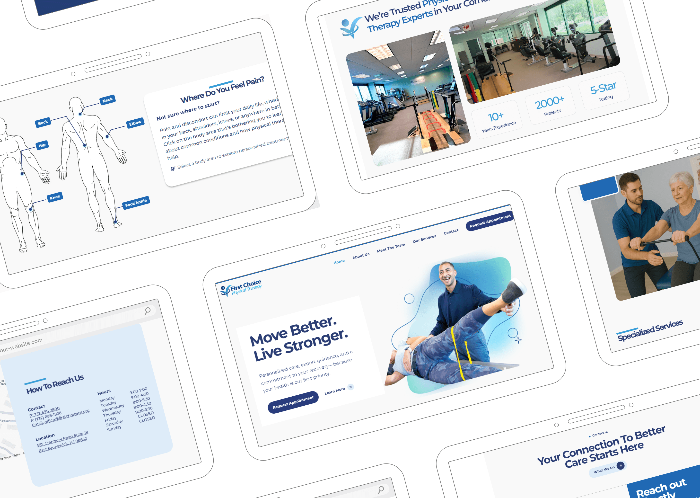
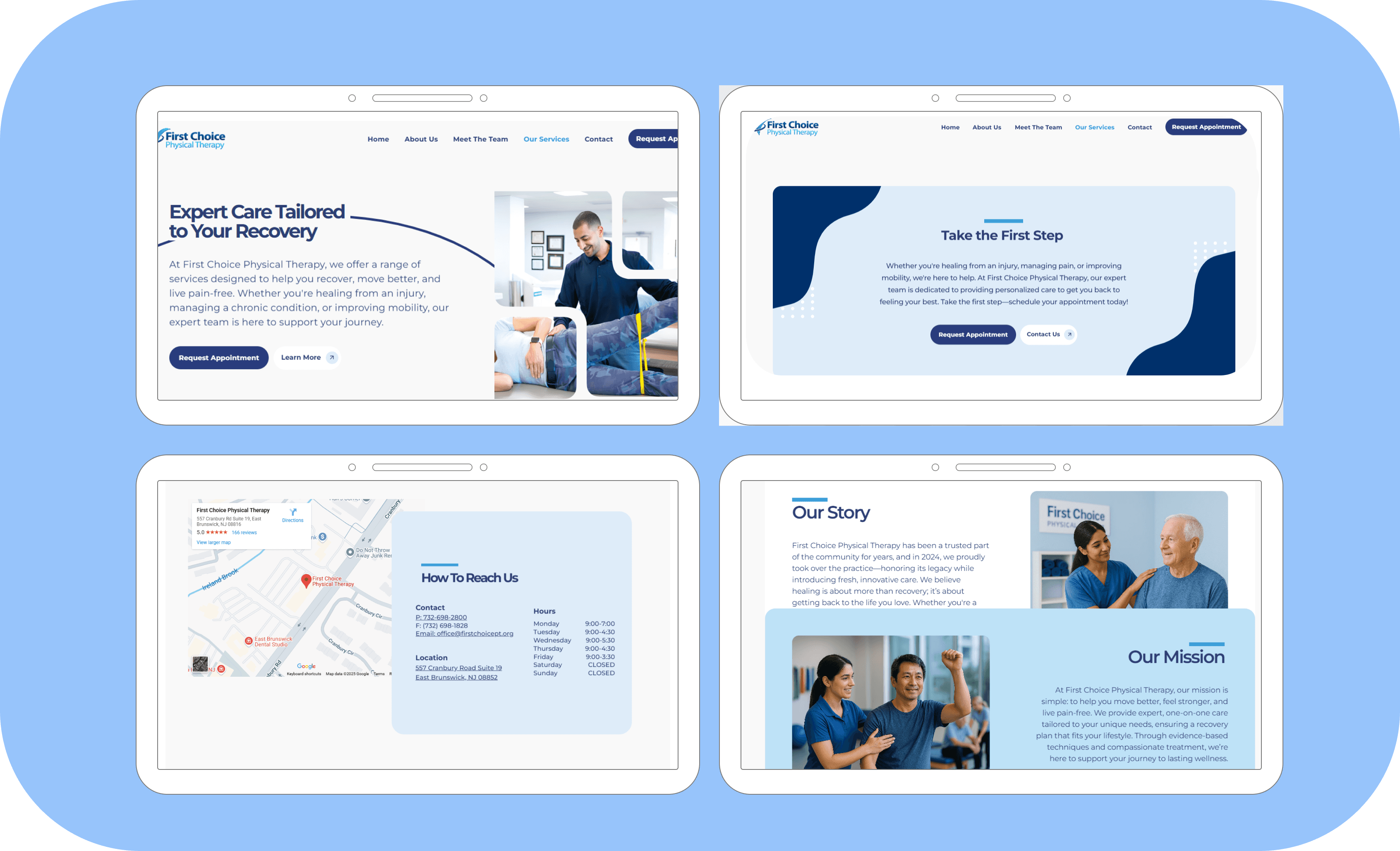
A professional, intuitive website that improves patient access, reduces operational friction, and builds trust
I designed and developed a fully responsive website that supports both new and returning patients while easing staff workload. The site was shaped around the clinic’s real-world needs and provides:
Clear service descriptions and treatment overviews
A custom multi-step appointment request form built with React in Framer
A responsive contact form with live validation, input formatting, and auto-disable logic
Insurance and FAQ sections to address common questions
A mobile-first layout to support on-the-go access
Staff bios and clinic info to build familiarity and trust
A dedicated patient intake section to streamline paperwork
The goal was to answer common questions, guide new patients with clarity, and give the clinic a professional online identity. Every feature was designed based on real conversations, patterns, and friction points observed during my work at the front desk.

USER RESEARCH
Frontline insight powered the foundation of the design
As the clinic’s Patient Care Coordinator, I was embedded in the real-time flow of patient interactions. I gathered qualitative insights daily — noting what callers were confused about, where paperwork delays came from, and what patients asked before showing up. I also conducted informal surveys with new and returning patients to validate priorities.
Key insights:
70% of new patients said they didn’t know what to expect before arrival
60% of calls involved repetitive questions that could be answered online
80% of our users access information on mobile first
Staff wanted a single link they could send to answer most questions


IDEATION & WIREFRAMING
Mapping content around patient needs and clinic priorities
Using user feedback and workflow observations, I built low-fidelity wireframes in Figma to map out content structure and information hierarchy. These wireframes helped align patient priorities with staff goals and gave shape to the homepage, navigation bar, and multi-step form flow.
Focus areas:
Keep navigation simple and intuitive
Prioritize services, appointment access, and insurance information
Design for mobile-first and accessibility
Balance patient needs with front desk workflow
Prototype early and get feedback quickly from staff and patients

VISUAL DESIGN & PROTOTYPING
Designing a warm, trustworthy interface that reflects the clinic’s tone of care
The visual direction was built around the clinic’s existing branding while focusing on clarity, friendliness, and accessibility. I created high-fidelity prototypes in Figma and validated each section with real users before moving into development.
Visual design highlights:
A calming palette of blue tones pulled from the clinic’s logo
Rounded icons and buttons to create an approachable, welcoming feel
Large, readable fonts with ample spacing for clarity
Mobile-first responsive layout with sticky navigation
Simple visual hierarchy that emphasizes appointment actions and FAQs
The final prototype balanced usability with personality, offering a professional yet friendly interface for patients of all ages and tech skill levels.
DEVELOPMENT IN FRAMER
Bringing the prototype to life with fully responsive, interactive components
After finalizing the design, I developed the live website in Framer. This allowed me to translate every layout and interaction detail without handoff, keeping the design intent intact from Figma to launch.
Development highlights:
Multi-step appointment request form built in React with conditional steps, calendar logic, phone number formatting, and field validation
Responsive contact form with auto-disable logic, real-time formatting, and a customized success message
FormSubmit integration for seamless email delivery without a backend
Fully responsive layouts and scroll animations for desktop and mobile
Sticky headers, hover interactions, and cross-device accessibility
Custom domain and SEO setup for discoverability
OUTCOME
A live website that improves experience for both patients and staff
Measurable impact (first 30 days post-launch):
3× increase in online appointment requests
40% decrease in repetitive calls to the front desk
70% of new patients submitted paperwork before their visit (up from 20%)
100% of staff reported easier patient referrals via the site
90% mobile task completion rate based on FormSubmit analytics
The website now serves as the clinic’s primary digital hub — reducing workload, building patient trust, and helping people navigate their care with confidence.
REFLECTION
Owning this project from research to deployment taught me how to lead with clarity and design with purpose
This project let me create a real-world solution for real users — people I interact with every day. I learned how to apply user research in a practical setting, simplify complex workflows, and use design to reduce stress for patients and staff alike. Building both the UX and the front-end structure deepened my understanding of how design and development come together to create a seamless experience. The results proved that thoughtful design, even in small spaces, can create lasting impact.